Tech Analysis
Preview: Night Vision Devices
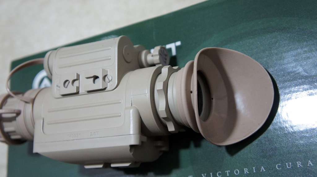
Recently I've been working on some night vision related content for the site, such as a primer on night vision as well as a review of a couple night vision devices.
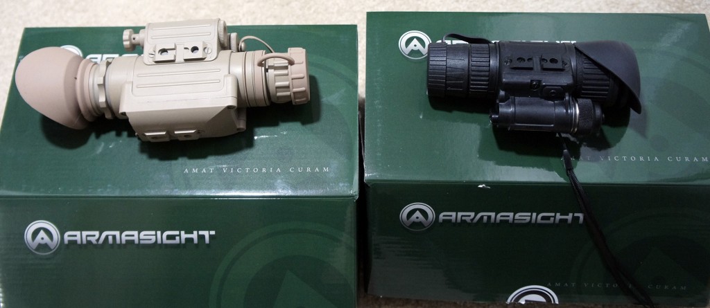
Armasight was kind enough to loan us their Spark CORE Night Vision Monoculars as well as their N-14 Gen 2+ QS Night Vision Monoculars.
These are basically Gen 1.5 and Gen 2+ devices, and in the near future I'll hopefully also get to play around with some Gen 3 and Gen 3+ night vision devices as well.
I've taken a few teaser pictures which I've included below:
The SPARK is on the left, and the N-14 is on the right.
Used my Nexus 5 to take a picture of the N-14 while looking through the SPARK.
This is my best attempt to take a selfie using a Sony NEX3 and the SPARK monocular.
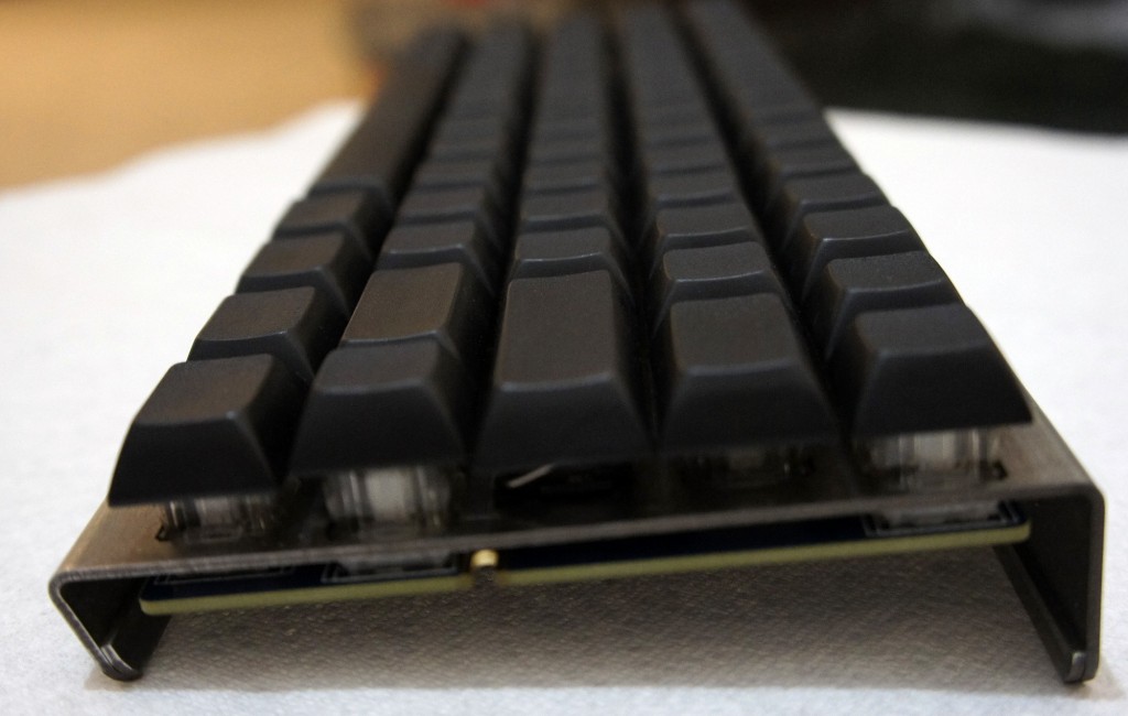
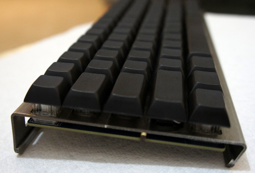
Infinity Keyboard: Building My Own Mechanical Keyboard
I’ve written a lot about mechanical keyboards in the past, but beyond user experience, I’ve never really had any other type of interaction with a keyboard. When I saw the Infinity Keyboard Kit for sale on Massdrop, I was enticed by the prospect of a keyboard with aspects that I could customize, but more importantly, the opportunity to build my own keyboard.
When I first purchased the kit, it was somewhat intimidating. As a software developer, any task remotely related to electrical engineering is a strange and scary one, but I figured I’d give it a shot anyways.
Choosing the Keyboard
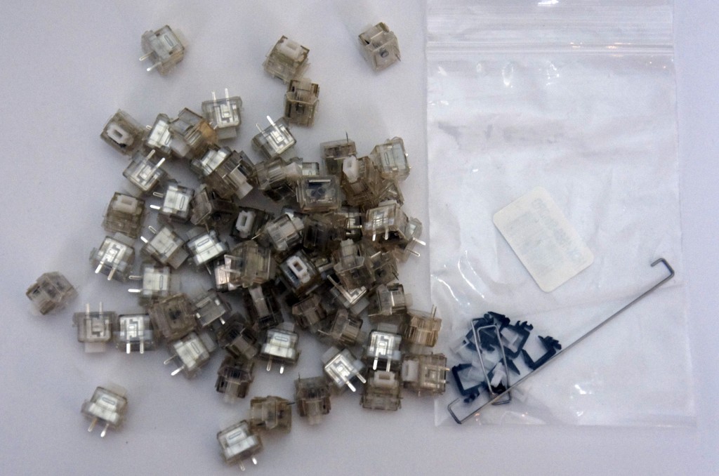
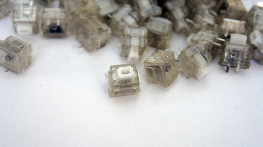
I ordered the kit with Matias Alps Clicky key switches, as I’m a huge fan of Cherry MX Green switches and thought the Alps switches might provide a similar but new experience.
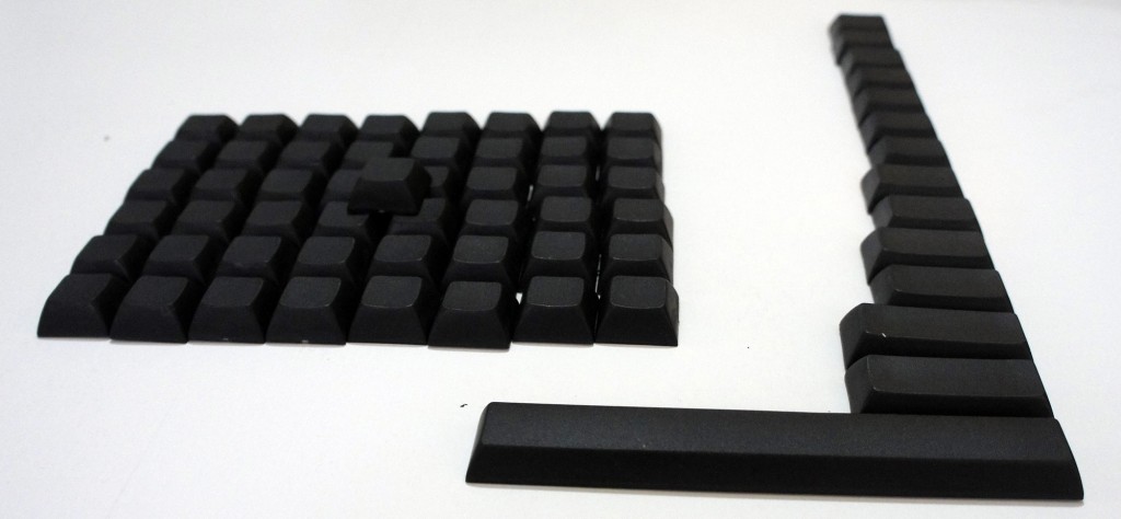
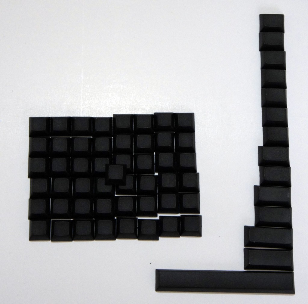
Next, I picked the blank Signature Plastics PBT keycaps available as an option on the Massdrop purchase, as finding Matias-compatible keycaps is not an easy task. Plus, the blank keycaps would come in handy when I started messing around with the keyboard configurations.
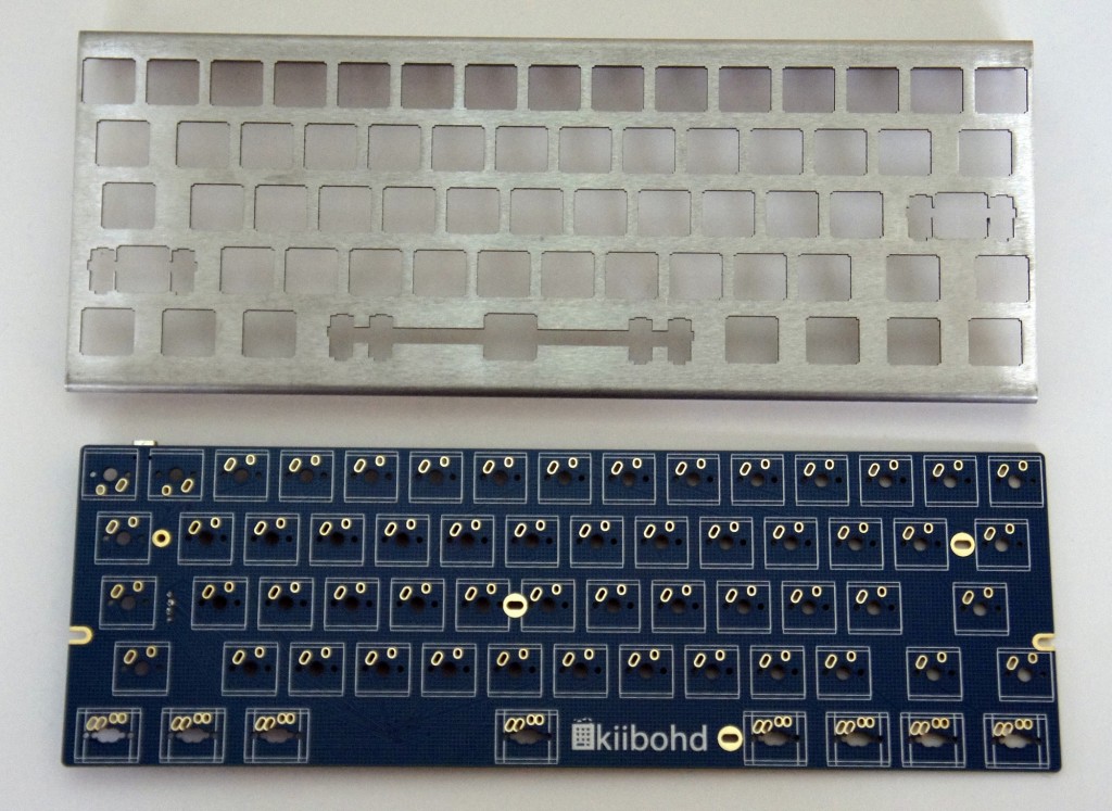
As for the chassis, I stuck with the purpose-built bent metal chassis, since it was designed for the Infinity Keyboard and has a nice industrial look to it.
Finally, the logic board used is a custom ‘kiibohd’ (get it? ‘kiibohd’ sounds like a British person saying ‘keyboard’, hilarious), designed to fit both Cherry and Matias Alps switches.
Getting Started
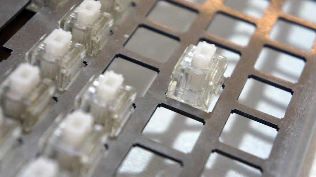
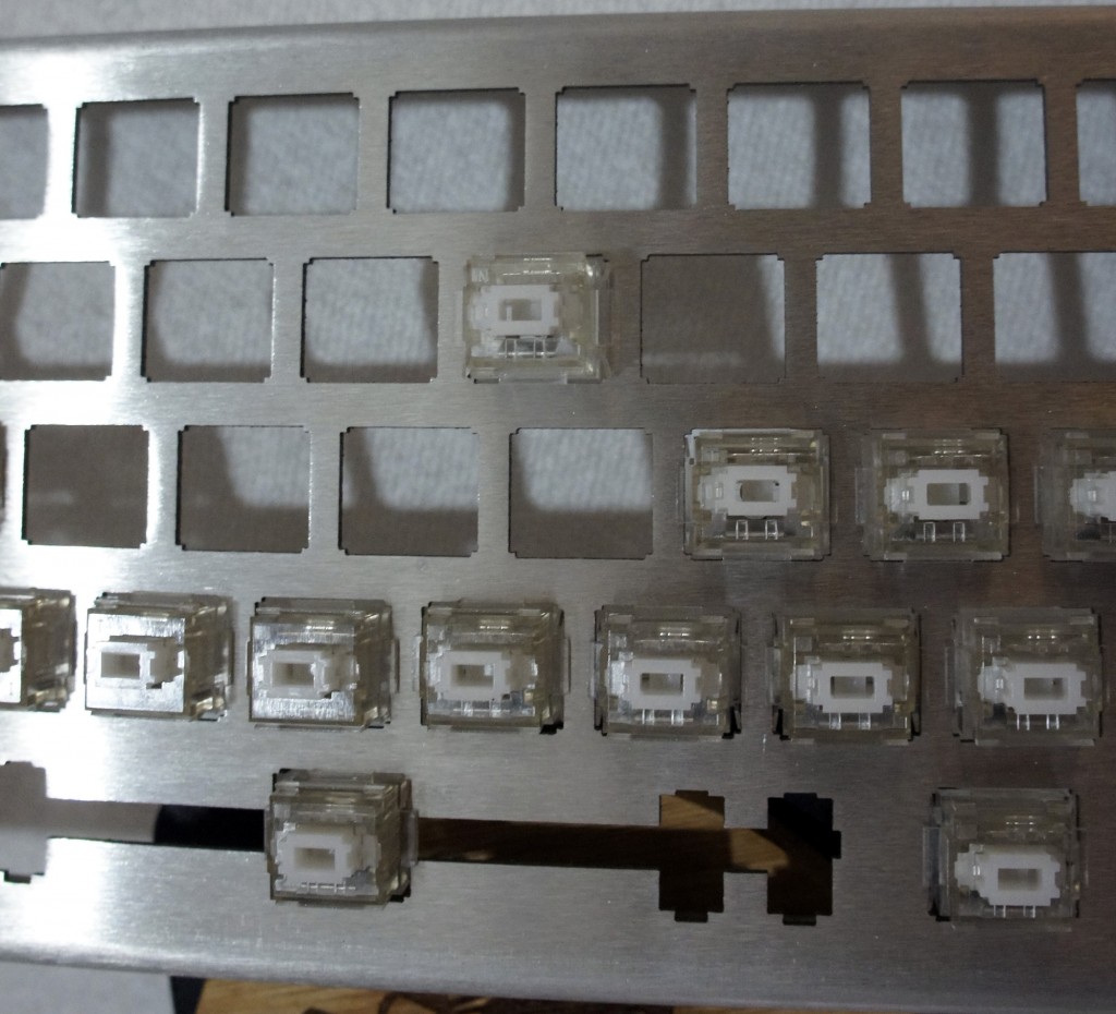
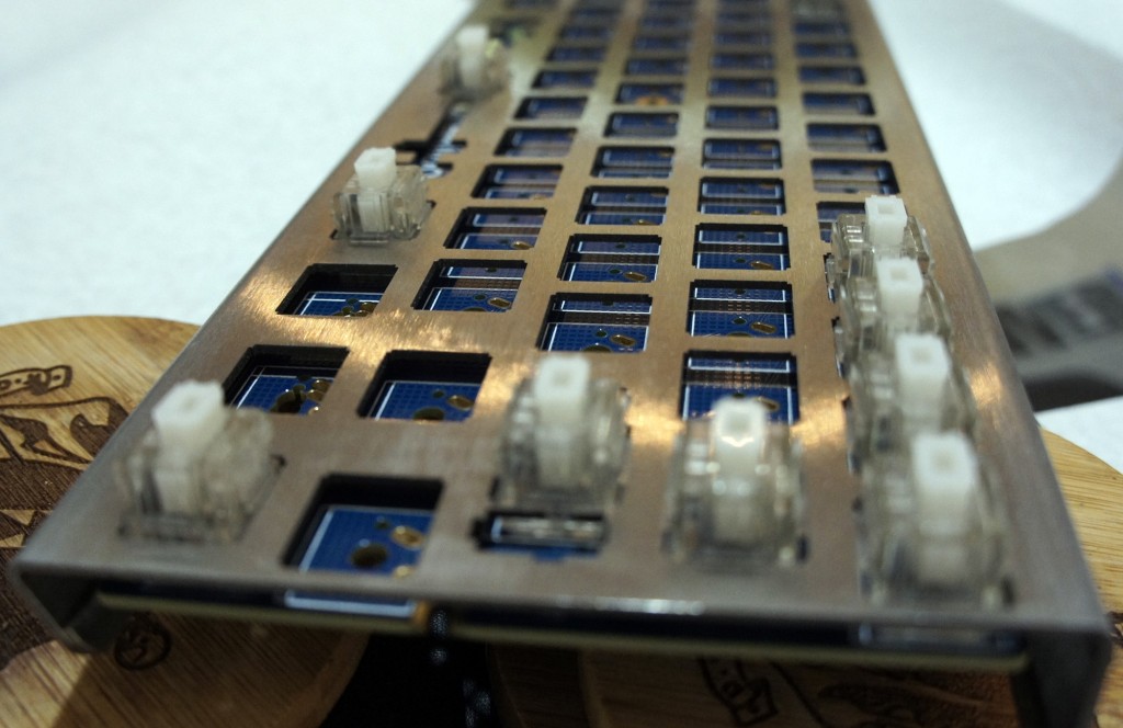
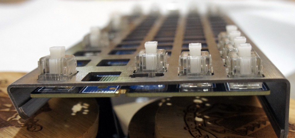
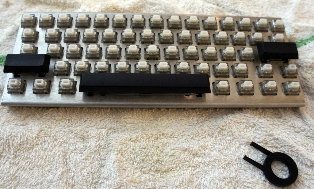
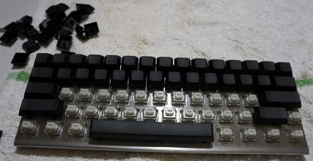
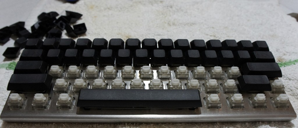
The process began with me putting the switches into the chassis. They went in from the top side of the keyboard, and the switches had to be pushed in until the little wings on the sides of the switches popped out on the bottom side of the keyboard. I could tell when they were in place because the plastic stoppers were flush against the metal of the chassis.
I made the silly mistake of putting in all the switches prior to sticking the logic board on. Unfortunately, this meant that lining up all the holes would be impossible, so I took the advice of someone on the Massdrop discussion and popped out all the key switches until I only had a couple in each corner. This made it easy to line up and stick on the board.
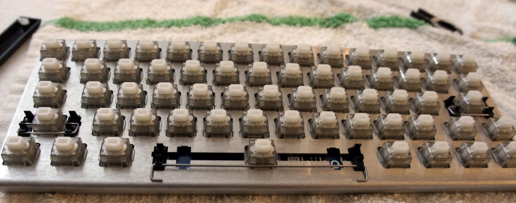
Once the board was in place, I began the process of sticking in the rest of the switches anew.
Soldering
The next step was soldering the switches to the board. This was probably the most daunting task to me, since I hadn’t soldered anything in approximately 10 years; the last time was in early high school, and I was hardly an expert back then.
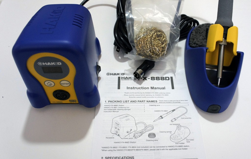
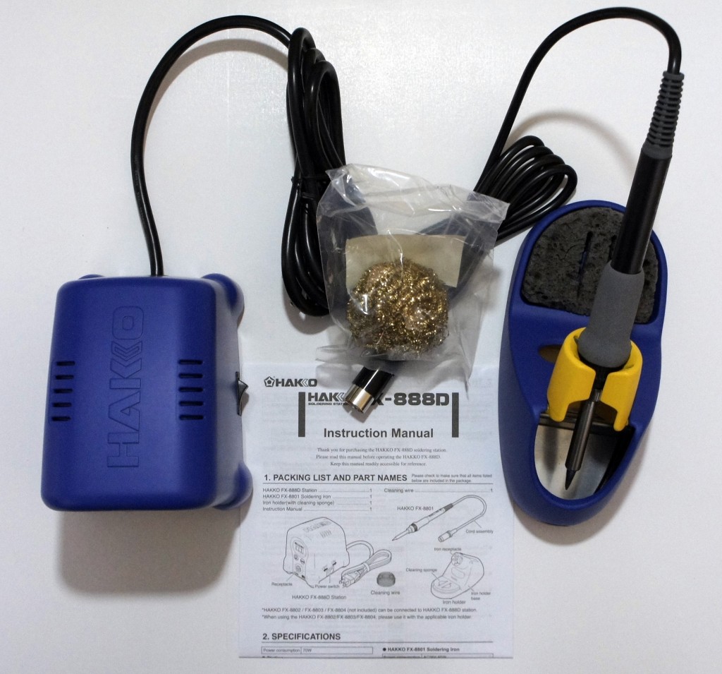
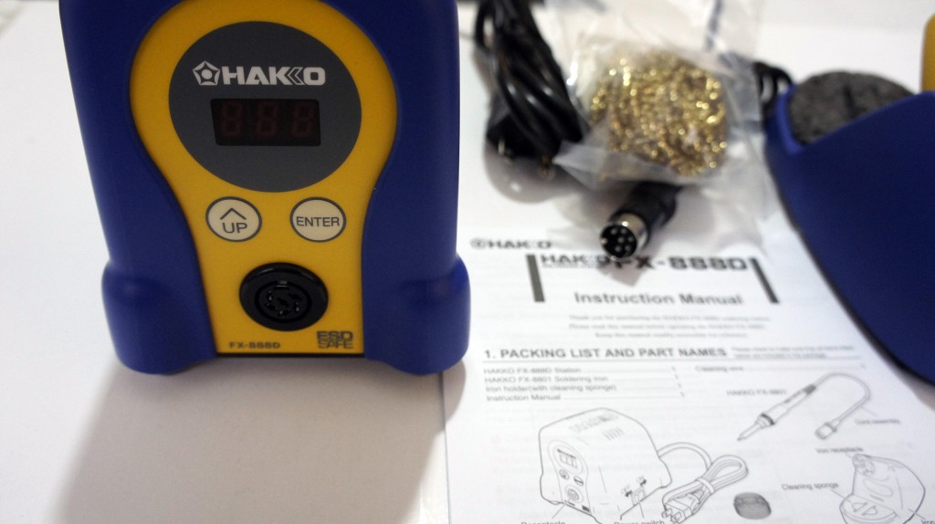
For my soldering kit, I picked up a Hakko FX-888D, since reviews for it are exceptional and a large portion of the internet seems to recommend it.
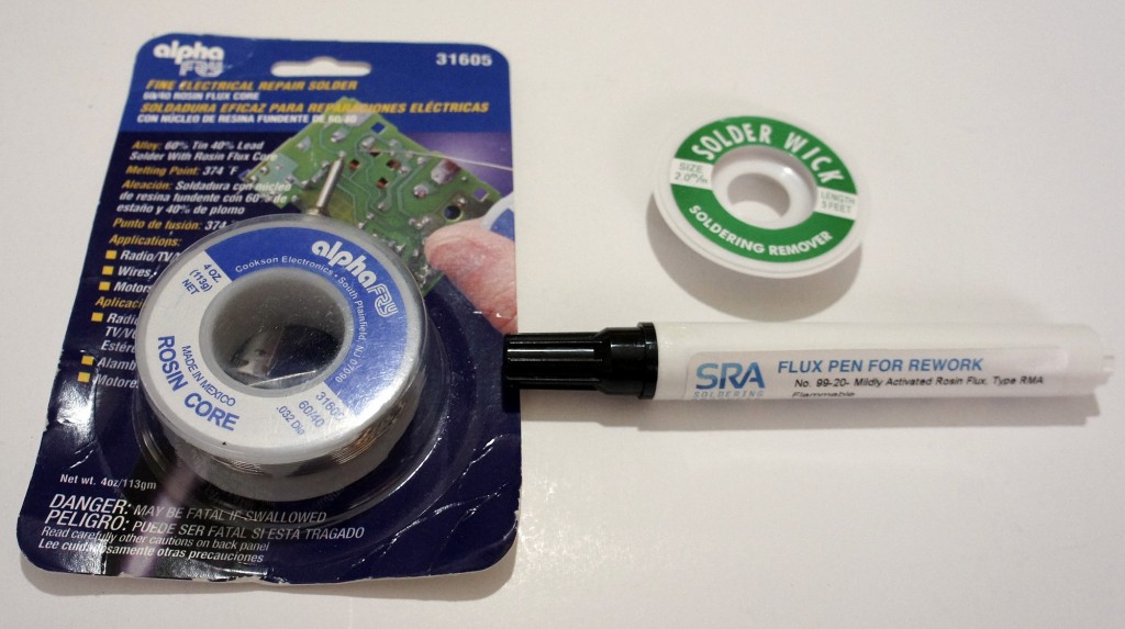
I also picked up some rosin-core solder, with the idea that it would be 60% lead and 40% tin, at the suggestion of my electrical engineer friend. However, despite the Amazon description, when it arrived it turned out to be 40% lead and 60% tin, but I figured I’d make do. I also picked up some solder wick and flux at my friend’s suggestion, since he assured me it’d make the process easier (it didn’t, I barely even used them).
Wanting to be safe, I asked the same electrical engineer friend if some paper towels on a glass table would make for a good soldering station. He reminded me that paper towels are quite flammable, and suggested that I at least consider a slightly less flammable dish towel as a workstation. I listened to his advice and went with that.
Soldering was a surprisingly easy process. The Hakko FX-888D is a great soldering iron; I just dialed in the temperature I wanted and I was ready to go. For the purpose of the keyboard, I opted to use 500°F as the temperature.
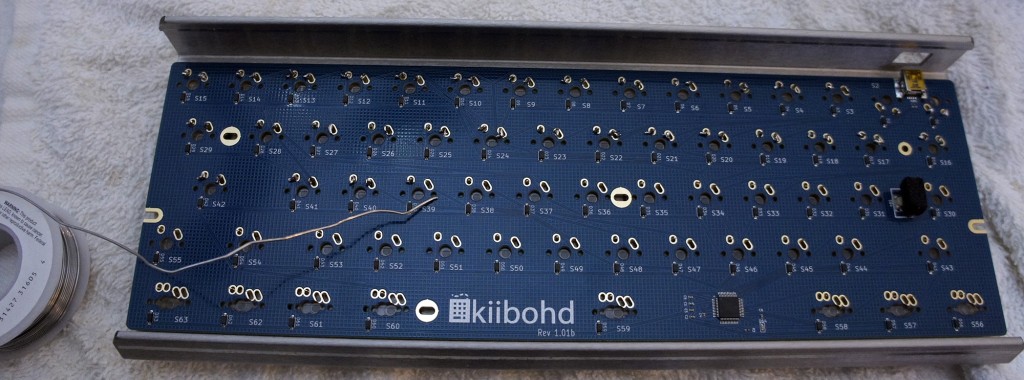
Despite my inexperience and lack of skill, the soldering process went fairly quickly and smoothly. All I had to do was touch the iron to the spot I wanted to solder, touch the solder wire to it, and let it melt right onto the connectors as I pulled away the iron.
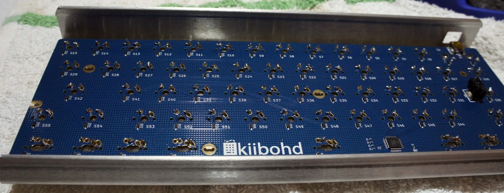
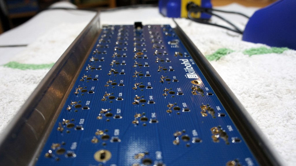
Once the soldering was done, I tested the keyboard to make sure all of the switches were reporting correctly. Each one worked perfectly, although my soldering job had much to be desired. Instead of nice, clean, smooth soldering, the back of the keyboard looks like a Terminator T1000 (the melty one) cried onto it. This made me regret choosing the open-backed chassis somewhat, since my soldering left the back of the keyboard sharp to the touch. I suppose I’ll just have to be careful when grabbing it.
Problems Arise
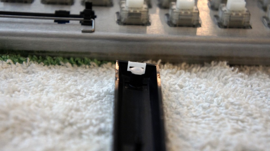
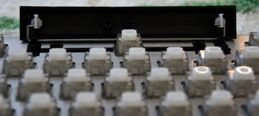
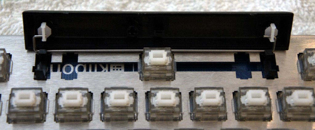
Next up was putting the keycaps onto the switches. Again taking the advice of the Massdrop discussion on the keyboard, I opted to start with the stabilized keys (spacebar, Enter key, etc).
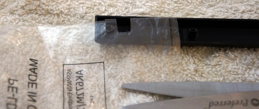
I noticed the stabilizers that attached to the keys felt fairly loose in their housing. Luckily someone online had the genius suggestion to cut tiny squares out of the plastic baggies the parts came in, and use them as a shim for the stabilizers.
This worked beautifully, and made the stabilizers sit tightly in their housing. Although something like super glue would probably work just as well, that’s a much more permanent solution, and the name of the game with the Infinity Keyboard is modularity.
However, while putting in the spacebar, I messed up a bit and got the stabilizing wire stuck under the stabilizers. I figured I would correct this mistake by pulling out the spacebar and fixing it.
Unfortunately for me, the Matias key stems are exceptionally tight, so it took an extraordinary amount of force the get the key out (My poor key-puller just gave up, and I had to use my fingers and a screwdriver to generate enough force to remove it).
However, once I got it out, I fixed the stabilizing wire and got back to work putting on the keycaps.
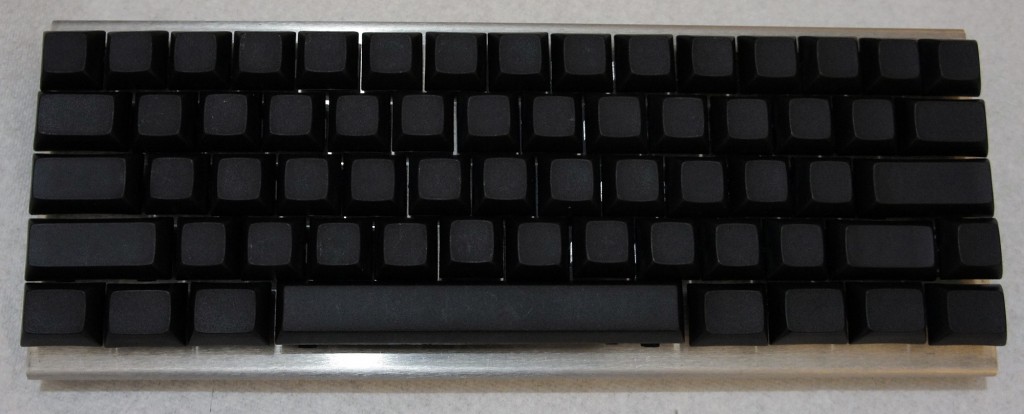
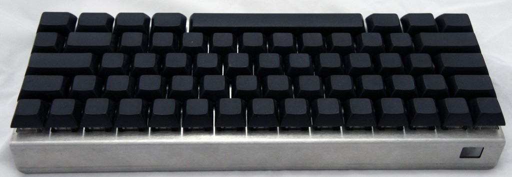
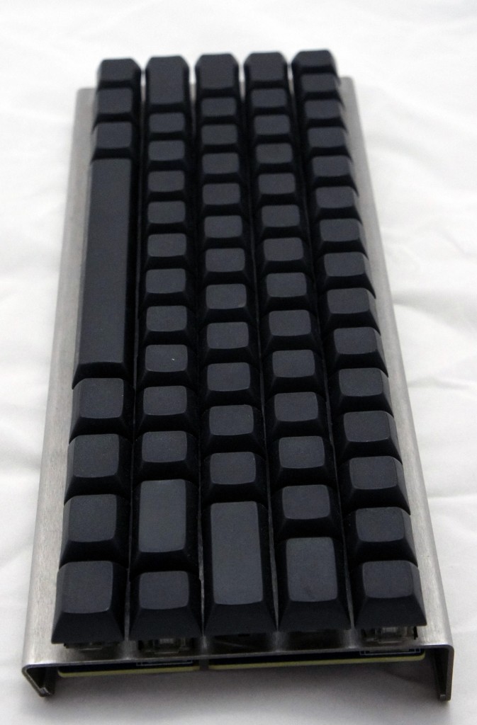
Once that was done, it meant I was done building my keyboard and it was ready to be used!
As you might expect by now, I had yet another unfortunate discovery when I began to type. All the keys worked well, except the spacebar would output anywhere between 1 to 10 spaces per keystroke.
At the suggestion of the Massdrop Infinity Keyboard discussion forum, it seemed like the best course of action would be to replace the key switch on the spacebar, as it had been speculated that maybe I damaged it when I removed the spacebar from it earlier.
Luckily for me, the keyboard kit included one extra key switch.
I figured the de-soldering process wouldn’t be much more difficult than the soldering process, but boy was I wrong.
The wick I had gotten barely soaked up any solder, and the solder was starting to get stuck in the holes in the logic board. As soon as I would melt it with my iron, it would solidify as soon as I started trying to push the switch out.
Eventually I pulled off enough solder to push the switch out, and replaced it with my backup switch. At this point I tested the keyboard with the new switch, and it worked flawlessly.
Now that I knew what I was doing, I was ready to put the spacebar onto the new switch and get typing.
However, nothing is that simple, and although I attached the spacebar without issue, the key tended to stick at the bottom of my keystrokes. This meant that I still ended up with unwanted spaces, although in some cases it meant I couldn’t hit the spacebar again when I wanted to.
At this point, I was out of extra key switches, and I knew that the force required when trying to remove the spacebar to try to diagnose the issue would cause the switch to break. I contacted Massdrop customer support to get some replacement switches and, hopefully, some advice.
They recommended trying to expand the spacers on the stabilizers, but that didn’t work. It also didn’t help that the spacebar appeared to be making contact with the keys directly above it and seemed somewhat out of alignment along the bottom.
I figured that maybe the spacebar was upside down, though the instructions never made mention of an ‘up’ and ‘down’ on the spacebar. Then again, the instructions were about as specific and helpful as a car-building manual comprised of useful steps along the lines of “get engine, put engine in car, apply wheels, finish car.”
Massdrop was kind enough to send me a free replacement key switch in preparation for the switch I was about to break. I also asked them send me a second backup switch in case I somehow managed to destroy the first backup, in case you are noticing a pattern here.
I removed the spacebar and switch using a soldering iron to loosen up the solder on the switch, pliers to pull the key switch out of the chassis, paperclips that were bent out of shape to pull on the spacebar, and my own tears of frustration. The tears were mostly a side effect, though I suppose they might have added some extra lubrication to the whole endeavor.
Once that was done, I put the new switch in the chassis, and plugged the keyboard in to test it and make sure everything worked properly.
After I was satisfied that the switch was fully functional, it was time to put in the spacebar.
I made sure the spacebar was flipped from the orientation it was in before (upside-down presumably). I attached the stabilizing wire to the stabilizers on the spacebar, and pushed it into place on the key switch.
To my dismay, the spacebar stuck at the bottom of the key press.
I immediately felt sheer terror at the nightmarish thought of having to remove the spacebar and key switch yet again.
In an act of desperation, I took a flathead screwdriver and pushed the one of the spacers out, certain it wouldn’t work.
To my amazement, the spacebar now moved freely.
Feeling like Thomas Edison probably felt when he pretended that he invented the lightbulb, I plugged the keyboard in to test each key.
My feeling of elation was quickly quashed as the “1” key didn’t seem to register key presses. The fear of having to replace a key switch was back almost as soon as it had gone. Feeling like I had eaten some bad Indian food, the sensation of fear in my gut returned as quickly as it had faded.
It looked like the soldering on the switch seemed ok, but given my complete ineptitude when it came to soldering, I figured I would melt it down a bit more to make absolutely certain it was making contact with the board.
A few seconds later, I plugged the keyboard back in, and finally everything worked properly.
I knew at the time that I should be feeling pride and joy for having completed my project successfully, but one singular thought consumed my mind: “never again”.
Conclusion
I got the Infinity Keyboard kit at a price of $157 after tax and shipping, with the intention to use it as a learning opportunity as well as benefit from having a rather unique 60% keyboard.
(A brief aside – keyboards tend to come in a few different sizes, most commonly: Standard, which includes all the typical keys, Tenkeyless [TKL], which excludes the number pad, and 60%, which excludes the number pad, arrow keys, and Home/Insert/Page Up/etc. keys.)
I certainly got my money’s worth as far as learning experience goes, though I was hoping the process would have been a bit more painless (emotionally and physically). I ended up with a fairly unique keyboard though, which I’m sure will impress all the people I know. It’s a known fact that nothing impresses people more than a keyboard.
At least the next time I build a keyboard (never), I’ll know what I’m doing. Also, as far as the key configuration goes, I have the option to compile my own firmware (as a software developer, this option disgusts me), use the default (as an enthusiast, this option disgusts me), or use the new Infinity configurator (as a lazy person, this option disgusts me). Oh well. I guess into the closet it goes.
Why Current Routers Are Substandard
Right now, there’s no perfect choice for consumers who are looking for a new router. Either the router won’t provide enough coverage, will have some issues maintaining a connection, or will have poor QoS (Quality of Service). Despite the fact that the majority of routers ship with most of their features intact, firmware updates are released so infrequently that any small bug can take months to resolve. This is a huge concern because within the next few years, the router may become the single most important component of the home computing experience.
Virtually all home networking routers are currently manufactured by a relatively small group of companies, all of whom purchase their chipsets from companies like Broadcom, Qualcomm Atheros, Quantenna, Celeno, and a few others. The most notable manufacturers in the consumer space are Netgear, ASUS, Linksys (now part of Belkin), Belkin, D-Link, Apple, TRENDnet, and Amped Wireless.
These companies’ latest products include ‘triple band’ AC routers that deliver 802.11ac in two 5 GHz bands and 802.11n in the 2.4 GHz band, usually with six antennas, such as the Netgear Nighthawk X6 and ASUS RT-AC3200. The routers also supposedly have bandwidth capabilities of up to 3.2 Gbps, despite the fact that the Ethernet port connecting the modem to the router is only capable of 1 Gbps.
Companies within the router industry label routers with terms such as AC1300, AC1900, AC2350 and AC3200, each of which indicate how many Mbps of bandwidth these routers are theoretically capable of providing. This means an AC3200 router would be 600 Mbps for the 2.4 GHz band, combined with two 5 GHz bands, each with 1300 Mbps of theoretical bandwidth. Together, those numbers combine to be 3.2 Gbps, even though realistically users can never see numbers like that, since no device can connect to all three bands simultaneously. Plus, when talking about connecting to the internet, the limitation will be based on the speed a person’s ISP provides, rather than the router’s bandwidth capabilities.
The need to have some level of overkill in terms of wireless performance makes sense when considering that signals weaken as devices are placed further away from the router, ensuring reasonable speeds even as some percentage of bandwidth is lost. However, many people buy these routers under the impression that they will be receiving a full 3.2 Gbps, and not something more like 300 Mbps or 181 Mbps.
Consumer routers have improved over time in terms of speed capabilities, number of ports, additional connectivity, and settings customizability. Despite all of these improvements, device support has taken a turn for the worse.
Although most routers ship with a basic 1 year warranty, it has become standard practice to only provide direct technical support for the first 90 days of a router’s use. This may be due to the fact that many consumers call their router manufacturer for assistance when their ISP is having a problem because they don’t know actually know what the difference is.
Even so, when a manufacturer provides a warranty on a product, they need to provide support up until that warranty period is over, for free. Apple is the exception in this case, as they have fantastic support for all of their consumer products, including routers. Also, Apple’s quality assurance seems to have much stricter standards than other consumer networking manufacturers, which means that frequent firmware updates are not as necessary for their routers.
Many router manufacturers won’t release firmware updates for their routers for months at a time, even when there are known firmware issues. Others will release firmware updates without thoroughly testing them, which causes them to put features into their routers that make them fundamentally insecure; ASUS’s countless security vulnerabilities being an obvious example here.
ASUS is no stranger to controversy, as they were accused of submitting fraudulent certification tests to the FCC in order for their routers to pass FCC certification. More importantly, their routers delivered higher signal output levels than the FCC allows (for safety concerns), and as a result, they seemed to perform better than their competitors in many reviews.
Eventually, the FCC found ASUS guilty of providing them with fraudulent certifications, and as a result, ASUS had to pay a $240,000 fine in order to ‘resolve equipment marketing investigations.’
The consumer wireless networking industry is fairly small, and most players simply do the same thing across the board, with just some minor differences in features. What these companies really need to start focusing on is improving customer service, as well as future technologies like MU-MIMO, which Linksys has already brought to market. Improved customer service also means squashing bugs through reliable and timely firmware updates and taking consumers’ concerns seriously. As more and more everyday devices and appliances start to utilize the internet for the first time, these companies will have to improve upon their routers that are quickly becoming an even more important component in the household.
G-Sync vs FreeSync: The Future of Monitors
For those of you interested in monitors, PC gaming, or watching movies/shows on your PC, there are a couple recent technologies you should be familiar with: Nvidia’s G-Sync and AMD’s FreeSync.
Basics of a display
Most modern monitors run at 30 Hz, 60 Hz, 120 Hz, or 144 Hz depending on the display. The most common frequency is 60 Hz (meaning the monitor refreshes the image on the display 60 times per second). This is due to the fact that old televisions were designed to run at 60 Hz since 60 Hz was the frequency of the alternating current for power in the US. Matching the refresh rate to the power helped prevent rolling bars on the screen (known as intermodulation).
What the eye can perceive
It is a common myth that 60 Hz was chosen because that’s the limit of what the human eye can detect. In truth, when monitors for PCs were created, they made them 60 Hz, just like televisions; mostly because there was no reason to change it. The human brain and eye can interpret images of up to approximately 1000 images per second, and most people can identify a framerate reliably up to approximately 150 FPS (frames per second). Movies tend to run at 24 FPS (the first movie to be filmed at 48 FPS was The Hobbit: An Unexpected Journey, which got mixed reactions by audiences, some of whom felt the high framerate made the movie appear too lifelike).
The important thing to note is that while humans can detect framerates much higher than what monitors can display, there are diminishing returns on increasing the framerate. For video to look smooth, it really only needs to run at a consistent 24+ FPS, however, the higher the framerate, the clearer the movements onscreen. This is why gamers prefer games to run at 60 FPS or higher, which provides a very noticeable difference when compared to games running at 30 FPS (which was a standard for the previous generation of console games).
How graphics cards and monitors interact
An issue with most games is that while a display will refresh 60 times per second (60 Hz) or 120 or 144 or whatever the display can handle, the images being sent from the graphics card (GPU) to the display will not necessarily come at the same rate or frequency. Even if the GPU sends 60 new frames in 1 second, and the display refreshes 60 times in that second, it’s possible that the time variance between each frame rendered by the GPU will be wildly different.
Explaining frame stutter
This is important, because while the display will refresh the image every 1/60th of a second, the time delay between one frame and another being rendered by the GPU can and will vary.
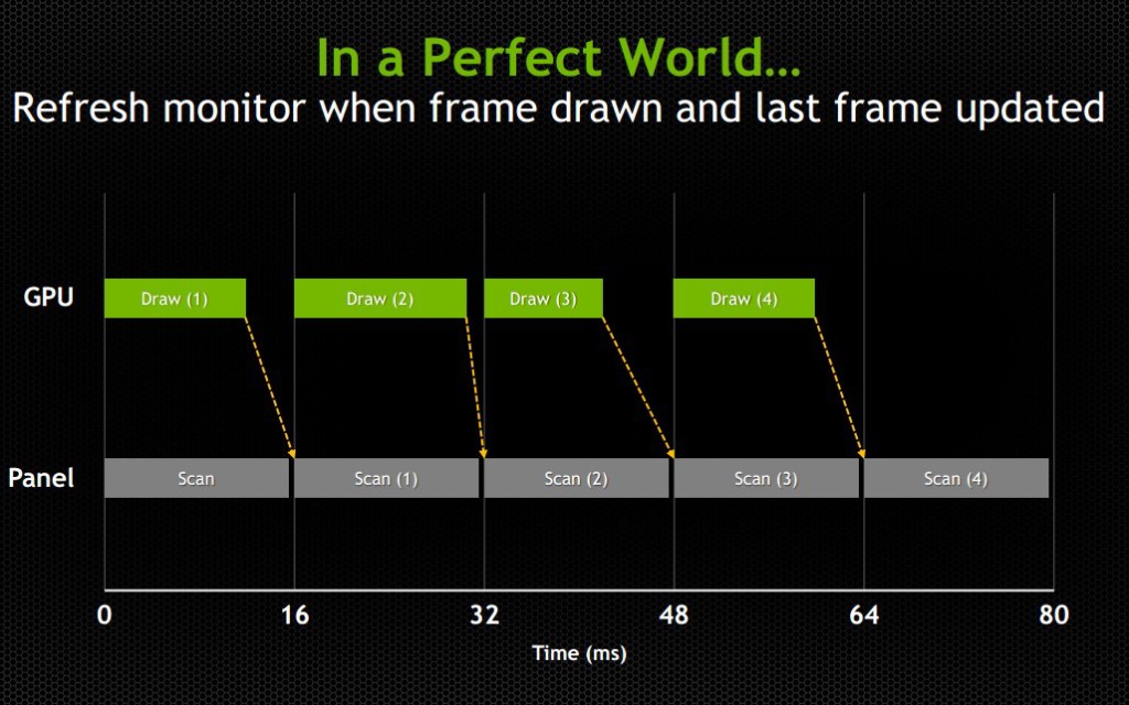
Consider the following example: The running framerate of a game is 60 FPS, considered a good number. However, the time delay between half of the frames is 1/30th of a second and the other half has a delay of 1/120th of a second. In the case of it being 1/30th of a second, the monitor will have refreshed twice in that amount of time, having shown the previous image twice prior to receiving the new one. In the case of it being 1/120th of a second, the second image will have been rendered by the GPU prior to the display refreshing, so that image will never even make it to the screen. This introduces an issue known as micro-stuttering and is clearly visible to the eye.
This means that even though the game is being rendered at 60 frames per second, the frame rendering time varies and ends up not looking smooth. Micro-stuttering can also be caused by systems that utilize multiple GPUs. When frames rendered by each GPU don’t match up in regards to timing, it causes delays as described above, which produces a micro-stuttering effect as well.
Explaining frame lag
An even more common issue is that framerates rendered by a GPU can drop below 30 FPS when something is computationally complex to render, making whatever is being rendered look like a slideshow. Since not every frame is equally simple or complex to render, framerates will vary based on the frame. This means that even if a game is getting an average framerate of 30 FPS, it could be getting 40 FPS for half the time you’re playing and 20 FPS for the other half. This is similar to the frame time variance discussed in the paragraph above, but rather than appear as micro-stutter, it will make half of your playing time miserable, since people enjoy video games as opposed to slideshow games.
Explaining tearing
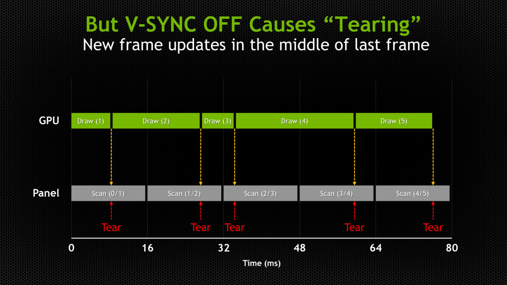
Probably the most pervasive issue though is screen tearing. Screen tearing occurs when the GPU is partway through rendering another frame, but the display goes ahead and refreshes anyways. This makes it so that part of the screen is showing the previous frame, and part of it is showing the next frame, usually split horizontally across the screen.

These issues have been recognized by the PC gaming industry for a while, so unsurprisingly some solutions have been attempted. The most well-known and possibly oldest solution is called V-Sync (Vertical Sync), which was designed mostly to deal with screen tearing.
V-Sync
The premise of V-Sync is simple and intuitive – since screen tearing is caused by a GPU rendering frames out of time with the display, it could be solved by syncing the rendering/refresh time of the two. Displays run at 60 Hz, so when V-Sync is enabled, the GPU will only output 60 FPS, designed to match the display.
However, the problem here should be obvious, as it was discussed earlier in this article: just because you tell the GPU to render a new frame at a certain time, it doesn’t mean it will have it fresh out of the oven for you in time. This means that the GPU is struggling to match pace with the display, but in some cases it will easily match (such as in cases where it would normally render over 60 FPS), whereas in others it can’t keep up (such as in cases where it would normally render under 60 FPS).
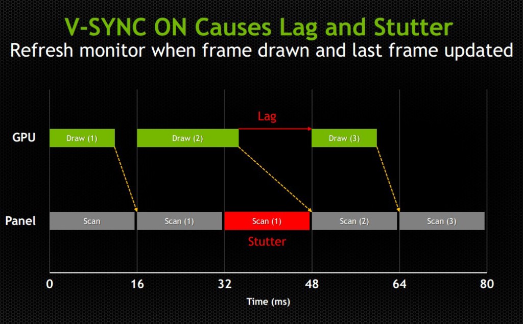
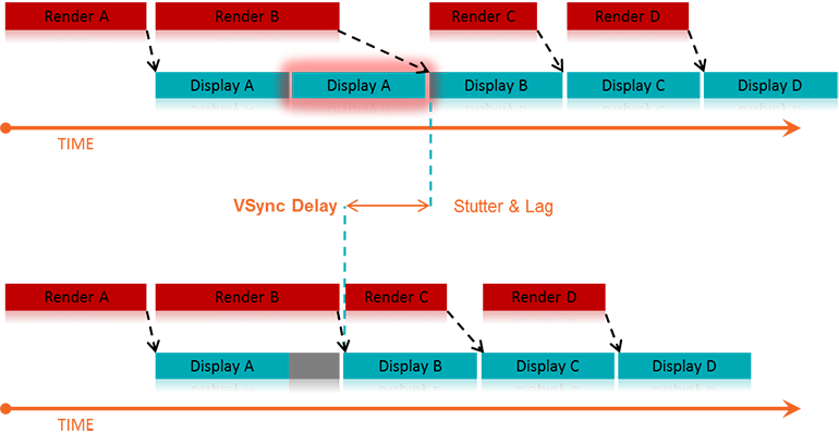
While V-Sync fixes the issue of screen tearing, it adds a new problem: any framerate under 60 FPS means that you’ll be dealing with stuttering and lag onscreen, since the GPU will be choking on trying to match render time with the display’s refresh time. Without V-Sync on, 40-50 FPS is a perfectly reasonable and playable framerate, even if you experience tearing. With V-Sync on, 40-50 FPS is a laggy unplayable mess.
For some odd reason, while the idea to match the GPU render rate to the display’s refresh rate has been around since V-Sync was introduced years ago, no one thought to try the other way around until last year: matching the display’s refresh rate to the GPU’s render rate. Surely it seems like an obvious solution, but I suppose the idea that displays had to render at 60, 120, or 144 Hz was taken as a given.
The idea seems much simpler and straightforward. Matching a GPU’s render rate to a display’s refresh rate requires the computational horsepower on the GPU to keep pace with a display that does not care about how complex a frame is to render, and just chugs on at 60+ Hz. Matching a display’s refresh rate to a GPU’s render rate only requires the display to respond to a signal sent from the GPU to refresh when a new frame is sent.
This means that any framerate above 30 FPS should be extremely playable, resolving any tearing issues found when playing without V-Sync, and resolving any stuttering or lag issues caused by having lower than 60 FPS when playing with V-Sync. Suddenly the range of 30-60 FPS becomes much more playable, and in general gameplay and on screen rendering becomes much smoother
The modern solution
This solution comes in two forms: G-Sync – a proprietary design created by Nvidia; and FreeSync – an open standard designed by AMD.
G-Sync
G-Sync was introduced towards the end of 2013, as an add-on module for monitors (first available in early 2014). The G-Sync module is a board made using a proprietary design, which replaces the scaler in the display. However, the G-Sync module doesn’t actually implement a hardware scaler, leaving that to the GPU instead. Without getting into too much detail about how the hardware physically works, suffice it to say the G-Sync board is placed along the chain in a spot where it can determine when/how often the monitor draws the next frame. We’ll get a bit more in depth about it later on in this article
The problem with this solution is that this either requires the display manufacturer to build their monitors with the G-Sync module embedded, or requires the end user to purchase a DIY kit and install it themselves in a compatible display. In both cases, extra cost is added due to the necessary purchase of proprietary hardware. While it is effective, and certainly helps Nvidia’s bottom line, it dramatically increases the cost of the monitor. Another note of importance: G-Sync will only function on PCs equipped with Nvidia GPUs newer/higher end than the GTX 650 Ti. This means that anyone running AMD or Intel (integrated) graphics cards is out of luck.
FreeSync
FreeSync on the other hand was introduced by AMD at the beginning of 2014, and while Adaptive-Sync (will be explained momentarily) enabled monitors have been announced, they have yet to hit the market as of the time of this writing (January 2015). FreeSync is designed as an open standard, and in April of 2014, VESA (the Video Electronics Standards Association) adopted Adaptive-Sync as part of its specification for DisplayPort 1.2a.
Adaptive-Sync is a required component of AMD’s FreeSync, which allows the monitor to vary its refresh rate based on input from the GPU. DisplayPort is a universal and open standard, supported by every modern graphics card and most modern monitors. However, it should be noted that while Adaptive-Sync is considered part of the official VESA specification for DisplayPort 1.2a and 1.3, it is important to remember that it is optional. This is important because it means that not all new displays utilizing DisplayPort 1.3 will necessarily support Adaptive-Sync. We very much hope they do, as a universal standard would be great, but including Adaptive-Sync introduces some extra cost in building the display mostly in the way of validating and testing a display’s response.
To clarify the differences, Adaptive-Sync refers to the DisplayPort feature that allows for variable monitor refresh rates, and FreeSync refers to AMD’s implementation of the technology which leverages Adaptive-Sync in order to display frames as they are rendered by the GPU.
AMD touts the following as the primary reasons why FreeSync is better than G-Sync: “no licensing fees for adoption, no expensive or proprietary hardware modules, and no communication overhead.”
The first two are obvious, as they refer to the primary downsides of G-Sync – proprietary design requiring licensing fees, and proprietary hardware models that require purchase and installation. The third reason is a little more complex.
Differences in communication protocols
To understand that third reason, we need to discuss how Nvidia’s G-Sync model interacts with the display. We’ll provide a relatively high level overview of how that system works and compare it to FreeSync’s implementation.
The G-Sync module modifies the VBLANK interval. The VBLANK (vertical blanking interval) is the time between the display drawing the end of the final line of a frame and the start of the first line of a new frame. During this period the display continues showing the previous frame until the interval ends and it begins drawing the new one. Normally, the scaler or some other component in that spot along the chain determines the VBLANK interval, but the G-Sync module takes over that spot. While LCD panels don’t actually need a VBLANK (CRTs did), they still have one in order to be compatible with current operating systems which are designed to expect a refresh interval.
The G-Sync module modifies the timing of the VBLANK in order to hold the current image until the new one has been rendered by the GPU. The downside of this is that the system needs to poll repeatedly in order to check if the display is in the middle of a scan. In the case that it is, the system will wait until the display has finished its scan and will then have it render a new frame. This means that there is a measurable (if small) negative impact on performance. Those of you looking for more technical information on how G-Sync works can find it here.
FreeSync, as AMD pointed out, does not utilize any polling system. The DisplayPort Adaptive-Sync protocols allow the system to send the signal to refresh at any time, meaning there is no need to check if the display is mid-scan. The nice thing about this is that there’s no performance overhead and the process is simpler and more streamlined.
One thing to keep in mind about FreeSync is that, like Nvidia’s system, it is limited to newer GPUs. In AMD’s case, only GPUs from the Radeon HD 7000 line and newer will have FreeSync support.
(Author's Edit: To clarify, Radeon HD 7000 GPUs and up as well as Kaveri, Kabini, Temash, Beema, and Mullins APUs will have FreeSync support for video playback and power-saving scenarios [such as lower framerates for static images].
However, only the Radeon R7 260, R7 260X, R9 285, R9 290, R9 290X, and R9 295X2 will support FreeSync's dynamic refresh rates during gaming.)
Based on these things, one might come to the immediate conclusion that FreeSync is the better choice, and I would agree with you, though there are some pros and cons of both to consider (I’ll leave out the obvious benefits that both systems already share, such as smoother gameplay).
Pros and Cons
Nvidia G-Sync
Pros:
- Already available on a variety of monitors
- Great implementation on modern Nvidia GPUs
Cons:
- Requires proprietary hardware and licensing fees, and is therefore more expensive (the DIY kit costs $200, though it’s probably a lower cost to display OEMs)
- Proprietary design forces users to only use systems equipped with Nvidia GPUs
- Two-way handshake for polling has a negative impact on performance
AMD FreeSync
Pros:
- Uses Adaptive-Sync which is already part of the VESA standard for DisplayPort 1.2a and 1.3
- Open standard means no extra licensing fees, so the only extra costs for implementation are compatibility/performance testing (AMD stated that FreeSync enabled monitors would cost $100 less than their G-Sync counterparts)
- It can send a refresh signal at any time, there’s no communication overhead since there’s no need for a polling system
Cons:
- While G-Sync monitors have been available for purchase since early 2014, there won’t be any FreeSync enabled monitors until March 2015
- Despite it being an open standard, neither Intel nor Nvidia has even announced support to make use of the system (or even Adaptive-Sync for that matter), meaning for now it’s an AMD-only affair
Final thoughts
My suspicion is that FreeSync will eventually win out, despite the fact that there’s already some market share for G-Sync. The reason for this is that Nvidia does not account for 100% of the GPU market, and G-Sync is limited only to Nvidia systems. Despite reluctance from Nvidia, it will likely eventually support Adaptive-Sync and will release drivers that will make use of it. This is especially true because displays with Adaptive-Sync will be significantly more affordable than G-Sync enabled monitors, and will perform the same or better.
Eventually Nvidia will lose this battle, and when they finally give in, that will be when consumers benefit the most. Until then, if you have an Nvidia GPU and want smooth gameplay now, there are plenty of G-Sync enabled monitors on the market now. If you have an AMD GPU, you’ll see your options start to open up within the next couple of months. In any case, both systems provide a tangible improvement for gaming and really any task that utilizes real-time rendering, so either way in the battle between G-Sync vs FreeSync, you win.
Steam Machines to Officially Launch in 2015
Valve has been talking about their Steam OS platform since 2013, we discussed it at length here. At CES 2014, it was the talk of the town, with many OEMs promising to release Steam Machines (defined as gaming PCs designed for living room use running Steam OS and utilizing the as yet unreleased Steam Controller) within the coming months after CES.
Later in 2014, it turned out that Valve had not yet finalized its controller design nor had it finished the Steam OS; as of the time of this writing, Steam OS is still in beta. Many system builders opted to release their systems as regular gaming PCs designed for living room use, and they opted to run Windows and include Steam with Big Picture mode enabled, along with a bundled Xbox 360 controller.
However, despite silence from Valve over the recent months, it has been confirmed by multiple sources that Steam Machines will have an official launch at GDC (the Game Developers Conference) in early March of 2015. The Steam Controller design has been finalized, and Steam OS is apparently ready to come out of beta. Multiple PC boutique builders are already ready to launch a variety of products designed from the ground up as Steam Machines.
What this means for Microsoft is that they'll have some new competition to face when Windows 10 comes out later this year. Valve is working quickly to bring games to Linux systems such as Steam OS, and PC builders might opt to go for Steam OS for gaming focused PCs in order to save money by not having to purchase a Windows license.
This is also an issue for Microsoft on the hardware front, as many of the Steam Machines will aim for a $500 price point, designed to compete with the Sony PS4 and Microsoft Xbox One.
Whether Valve will be successful in pushing Steam Machines is yet to be determined, but while everyone expected 2014 to be the year of Steam Machines and Steam OS, it obviously didn't happen, but 2015 is now confirmed.
We don't have any details yet on the finalized Steam Controller design, but we'll update this article as soon as we do (although it might unfortunately not be until official release at GDC).
Valve, Steam, and the Future of Living Rooms
So after a tumultuous week of announcements to revolutionize the industry, Valve Software saved their best for last and announced a... controller? Okay, sure, it looks a bit like an old fashioned boom box with its two trackpads and odd button arrangements, but what exactly are they trying to do? While it’s certainly no Half-Life 3 or Source 2 engine announcement, their approach to the not-quite-a-console in the living room has some high minded implications for the gaming and multimedia community as a whole.
There’s been a lot of discussion and speculation about Valve’s future plans, especially since news broke about how Valve had patented the design of some new gamepad that would feature replaceable control options ranging from the traditional stick to a roller ball that would attempt to emulate mouse movement. However, to focus on an analysis of just the controller itself, and how the ergonomics and button layout deliver a seemingly streamlined FPS experience where it counts, while also opening up the interface to even RTSs in the Big Picture living room environment would have too narrow a view to really get at what it appears Valve is aiming to accomplish.
So what are they aiming for? Empire, in a single word. From the amount of secrecy in their development, along with the amount of industry pressure they can exert with their position, Valve seems to be thinking much bigger than their own Big Picture. To begin, let’s just follow the line on what they’ve announced this week.
SteamOS. Something that is guaranteed to be the most user friendly way of introducing Linux to the masses. While those of us with some computer experience are probably familiar with Ubuntu, CentOS, Redhat, or any of the other myriad of Linux distributions out there, really the only one that the general public has ever even heard a whisper of would be Ubuntu. However, that alone wasn’t good enough. Despite the billionaire at its head and a foundation to do the work, Ubuntu never really had the pull it needed to achieve the fabled ‘year of the Linux Desktop’. They’re expanding to phones soon, and tablets, but where is the first party support for high end graphics and awesome drivers? Valve solves that quite simply: by being the leading digital distribution service for games, it’s fairly obvious to see why NVIDIA was so willing to work with Valve on this project. So what are the implications? Significantly better Linux drivers and Bazaar driven development in the way Valve (amongst other companies) has created and released easy to use SDKs and programs for their zealous communities to release new content and fixes through venues such as Steam Workshop. If Valve keeps this up and makes Steam OS as hackable and free as most other Linux distros (and they’ve suggested it will be), then it will have the potential of being the largest mass market distribution service available short of the Google Play marketplace.
The Steam Machine: here’s a tough one to not wildly speculate on. Taken to its furthest extreme, it has multiple implications for console gaming, ubiquitous computing, and the future of multimedia in general. PC Gaming has been sitting on top of the pile for quite some time now as the ‘best’ method of gaming (for various reasons I won’t get into here), but of course there are a number of things required to get a good setup that can do all the things you want it to do. At the 2013 CES, Valve announced the Piston ‘Steam Box’ in a partnership with Xi3. After doing so, they disappeared from CES and left a cardboard cutout of a cat with a sign taped to it saying “The Valve booth is meow closed”. By the time March rolled around, Valve had already distanced themselves from the entire project. What this new Steam Machine prototype suggests is a different market entry method for people who wouldn’t normally go in for a typical PC gaming experience. Coupled with the fact that the box itself will run a Linux derivative and is meant to exist in the living room space, the Steam Machine stands to be an interesting not-quite-console that could serve well as a spare PC for PC gamers who already have a powerful machine, an entry level PC for people coming from the console world, or if this expands far enough - a home multimedia box for the whole family.
The Steam Controller. With the move from focusing on desktops and laptops to home theatre setups and HDTVs, obviously the fine grain mouse and keyboard interface wasn’t going to survive the transition very well. So what does the Steam Controller mean for those of us who are hesitantly buying in to all this Valve hype? I, for one, am intrigued by the idea of leaving the hardware open and replaceable for the community. What strange creations this could result in by being coupled with devices such as Oculus Rift or other traditional interfaces has yet to be seen, but some hacker out there will likely be inspired. The controller adds a small touchscreen and extended accessibility to the interface. The implementation of the two large haptic, clickable trackpads is a step in the right direction for those of us converting from the old mouse and keyboard method, at least in trying to preserve the fine granularity of aiming precision while also giving us the full 360 degree motion of an analog stick. This won’t replace the keyboard as far as data entry and interaction goes, but the controller does seem to be an interesting idea to bring mouse- and keyboard-only games to the living room screen. Plus, Valve’s more eccentric ideas tend to become a pretty big deal, even if no one sees the use for two track pads that can be speakers as of the moment.
To try and figure out what game Valve happens to be playing - which seems to be closer to Stratego than Chess here - quite a fair bit of baseless speculation can take us into the future of consumer computer interaction. Gabe Newell has been quite vocal since the release of Windows 8 that the entire OS is dead to him now, and with Steam OS, he has thrown in his lot with Linux and its derivatives. What this will mean for us in the long run is better drivers and more games that will be Linux compatible, which is guaranteed to give Microsoft a run for its money. On top of that, backwards compatibility with games that are Windows-only has the potential of being solved through Wine, or at least a Wine-like interface. Taking a step back from the nuts and bolts, the addition of Steam as an alternative living room platform in tandem with Smart TVs and smart homes pushes out Valve’s sphere of influence from simply being digital distributors for games.
From what we’ve seen of Valve’s announcements, and the lack of Half-Life 3 or Source 2, or any of the other projects Valve has in the works, it seems that they’ve really switched gears from being a software development group to more of a technology think-tank that can sell their projects. The full extent of what they have planned is yet to be seen, but it’s guaranteed to shake up the gaming and entertainment world.
Barnes & Noble Nook HD+ Still Provides Best Value
In the last couple of years, the tablet market has become increasingly more crowded and competitive. However, in each generation, there are a number of standout models to consider in each tier. The latest generation had the Apple iPad and Google Nexus 10 in the top tier, comprised of 10 inch tablets. Just below that were the Amazon Kindle Fire HD 8.9 inch model and the Barnes & Noble Nook HD+ 9 inch tablet. And in the 7 inch range were the Amazon Kindle Fire HD, the Barnes & Noble Nook HD, the Google Nexus 7, and the iPad Mini.
Many of those lines are currently in the process of being refreshed. The Google Nexus 7’s second iteration has already been released, Amazon is on the verge of refreshing their entire line, Apple is expected to release new iPad models within the next 3 weeks, and there are rumors swirling of a new Google Nexus 10 possibly being released in Q4 2013. Some of you may have noticed I made no mention of a new Barnes & Noble tablet on the horizon. With that in mind, this next statement may seem like an odd one: the Barnes & Noble HD+ provides by far the best value for a tablet, and will continue to do so even as the new generation of tablets release this fall.
Many of you will ask “How is that possible? That tablet was released almost a year ago, and there are newer and better tablets forthcoming, plus the previous generation of tablets will all drop in price.” There are two parts to that question, and I’ll address each of them separately.
The first part is a question as to how a year old tablet can compete with brand new top of the line tablets. The answer to that is simple: price. The Barnes and Noble HD+ is currently selling for $149 with 16GB of storage included, the brand new Nexus 7 sells for $229 with 16GB of storage included. Look back to the first paragraph of this article: the Nexus 7 originated in a lower tier than the Nook HD+, 7 inch tablets vs. 9 inch tablets. Despite this fact, it currently sells for a significantly higher price. Of course someone familiar with these tablets will point out that the Nexus 7 now has upgraded parts and performance, so I urge you to compare the two tablets.
Nexus 7 (2013) (configured at $229) –
- SOC: Qualcomm Snapdragon S4 Pro APQ8064
- RAM: 2 GB
- Storage: 16 GB
- Camera: 5 MP rear, 1.2 MP front
- Battery: 3950 mAh
- Screen Size: 7.0 inches
- Resolution: 1920x1200
- Weight: 10.55 oz
- Expandable Storage: None
Nook HD+ (configured at $149) –
- SOC: TI OMAP 4470
- RAM: 1 GB
- Storage: 16 GB
- Camera: None
- Battery: 6000 mAh
- Screen Size: 9.0 inches
- Resolution: 1920x1280
- Weight: 18.17 oz
- Expandable Storage: Up to 64 GB (microSD/microSDHC/microSDXC)
Some would look at those numbers and feel vindicated in choosing the Nexus 7 (2013) over the Nook HD+, but you may want to consider some things first. Yes, the Nexus 7 has 2 cameras and the Nook HD+ has none, the Nook HD+ is heavier, it has less RAM, and it doesn’t run stock Android. However, it does have some key advantages such as a battery that’s over 50% larger than the Nexus 7, it has an ever so slightly higher resolution, it has a larger screen (which is usually considered an advantage when talking about tablets), and it has expandable storage. Not to mention the obvious fact that it’s a full $80 cheaper, something that becomes even more significant when considering the low price brackets these tablets are competing in. The pricing becomes even more impactful when talking about upgraded storage: the 32 GB Nook HD+ is $179 ($30 more than the 16 GB) whereas the 32 GB Nexus 7 is $269 ($40 more than the 16 GB). Also, because the Nook HD+ has expandable storage, the user can add an extra 32 GB onto either model for a mere $20.
In regards to the second point from the question above, which was basically “how can the Nook HD+ compete against older tablets that will see price drops?” I provide you with the following example. The original Nexus 7, which began in a lower tier than the Nook HD+ at its release, has been given a price drop due to the 2013 model being released. The old Nexus 7 has a less powerful processor, the same amount of RAM, a smaller battery, smaller screen, worse resolution, has no expandable storage, and only comes with a 1.2 MP front facing camera. So why does it currently retail for $179?
I can provide similar examples for all the tablets currently on the market and forthcoming to the market, but that would make this article excruciatingly long. I chose to use the Nexus 7 as my example because its new iteration has already been released and we can see how the price of the old model has been affected. To those of you still skeptical, I say good luck finding a 1080p tablet at $149 other than the Nook HD+. I also say good luck to those trying to find a 1080p tablet with expandable storage at $149 that is not the Nook HD+. There is no better value on the market, and there isn’t anything on the horizon that will provide better value.
This isn’t to say there aren’t downsides to the Nook HD+ of course; I hardly think it’s a perfect tablet. I would prefer it if it had cameras for video chatting, and having more RAM and a faster processor would be nice. I also dislike the fact it runs Barnes & Noble’s proprietary skinned Android, though I applaud Barnes & Noble for providing open access to the Google Play marketplace with their last update to the Nook HD+ (2.1.0). However, for those willing to do so, users can change the OS on their Nook HD+ to something more appealing such as CyanogenMod 10.1 (Android 4.2) or 10.2 (Android 4.3).
Now the question becomes “why is Barnes & Noble selling these tablets so cheaply?” The answer includes a variety of factors, the primary being slow sales. When the Nook HD+ launched, it was priced at $269, the same price as Amazon’s Kindle Fire HD 8.9” and more expensive than the Nexus 7. Also, until May 2013, the Nook HD+ did not have support for the Google Play market and limited users to the few offerings in the Barnes & Noble Nook App Store. The Amazon Kindle Fire series at least made it possible to sideload apps despite not providing Google Play access, whereas the Nook HD+ had its OS too locked down to make sideloading a feasible workaround. This made the Nook HD+ a fairly unappealing option for the first six months since its release.
The low sales caused Barnes & Noble to drop the price of the Nook HD+, using the gaming console strategy of selling the consumer hardware without making a profit, and instead making profit on the software the user will buy for the platform. This strategy still did not work for Barnes & Noble because the downsides of being tied down by the Nook App Store were too significant to overcome despite the price difference since a useless tablet is still useless regardless of how cheap it is. Barnes & Noble then made the surprising decision to give users access to the Google Play marketplace, much to the delight of owners and consumers, because this suddenly made the Nook HD+ became a viable tablet.
From a financial perspective, this was highly problematic to Barnes & Noble. They would not be making money on software, because the vast majority of app purchases were happening through the Google Play marketplace, and they would be making very little money on hardware because although sales were up, they had dropped the price on the tablet significantly already. The obvious solution would be to raise the price back up, but consumers don’t take kindly to price increases on aging technology, so that wasn’t really an option.
At this point, Barnes & Noble made the decision to stop making Nook tablets, and that instead they would work with third-party manufacturers to co-create tablets, though they would continue making e-readers. In order to clear stock, they would sell off the Nook HD+ tablets at close to the cost of making them.
While this provided the opportunity to buy a $149 1080p Android tablet with expandable storage, there was a major concern that prevented me from recommending it to everyone. Since Barnes & Noble said they would cease to make their own tablets, it was highly likely that they would cease development and support for their existing tablets. This would be a situation highly familiar to adopters of the HP tablets running WebOS.
Luckily though, Barnes & Noble reversed their decision and decided that they would in fact continue making Nook tablets. This means that we can confidently expect future support for Nook devices.
At $149, the Nook HD+ is tough to beat, regardless of what new tablets are coming to market. It gives you a full HD screen, expandable storage, access to the Android store, the option to flash it with a custom ROM, and a generally solid experience. If you’re looking for value, look no further, because the Nook HD+ cannot be beaten.
Lessons From Not Operators
1. Research is key
Firearms - Before buying anything firearms related, research it in detail. Read reviews, research the ammo ballistics, check out the competition. Know how it works, how to take it apart, and how it shoots. Don’t buy into the hype that it’s ‘mil-spec’ or made for DEVGRU or was used by the SAS. Military contracts are cheap and lowest bidder and serve only as the lowest standard of form and function. You want to be sure you’re buying the best tool for your purposes, and you don’t want any surprises. Make sure you research prices and market fluctuations as well, and be on the lookout for deals to save yourself some money.
Technology - Before buying any device, research it. Read reviews, research specifications, licenses, hardware, build quality, software, and check out the competition. Know how it works, how to take it apart if possible, and what the benefits/disadvantages are. As with the above, don’t buy into the hype and ecstatic promises; benchmarks and independent verification are the most important factors. You want to be sure you’re buying the best tool for your purposes, and you don’t want any surprises. Make sure you research prices and next generation release dates as well, and be on the lookout for deals to save yourself some money.
2. Save up for what you really want
Firearms - If what you want is a $2000 AR15, do not buy a $700 AR15, do not buy a $600 AK, do not buy a $700 Galil. If what you want is a $1700 Nighthawk Custom 1911, do not buy a $1200 Kimber 1911, do not buy a $700 Sig Sauer pistol, do not buy a $600 Glock, or even a $500 CZ. You will not be content with a substitute. If you think it will “tide you over until you can afford it”, you are wrong. It will cost you more money overall to keep “tiding yourself over” than it would to save up and buy your original desire, and you’ll ultimately be much happier with the gun you really want.
Technology - If what you want is a $1500 Digital Storm PC, do not buy a $1000 Dell PC, do not buy a $600 HP PC. If what you want is a $650 Samsung Galaxy S4 phone, do not buy a $480 Motorola Droid Razr M, do not buy a $300 LG Nexus 4 phone. You will not be content with a substitute. Keep in mind your computer/tablet/phone/etc will probably be with you for at least a few years. Do not buy something mediocre and expect to be happy with it for 2 years, or even expect it to last that amount of time. Spend the extra money because you will be happier with the end result. $700 spent on a device you won’t enjoy is $700 you’ve thrown away, $1500 spent on a device you’ll love is $1500 you’ve spent wisely. If you can’t afford it, save for it, don’t compromise. While you are saving, be sure to keep an eye on the news of what’s coming for the next generation: a vast majority of technology is refreshed in yearly periods, with new models and improvements being released constantly and consistently. Though you may not have the money now for what looks like the best thing, a greater, better thing is usually on its way.
3. Focus your spending on what will provide the most value
Firearms - This means your money is better spent buying more ammo than buying more firearms. Shoot the guns you have and become proficient. Put in the time and the money to master the guns you have rather than to expand your collection. Buying more guns will not improve your accuracy, precision, or speed, but buying practice ammo and a shot timer will. Feel free to diversify once you’ve sufficiently mastered what you have, it’ll be a well deserved reward. However, do not neglect those skills, buying a new gun doesn’t mean you can stop practicing with your old ones. This also means you should both select and put more money into a primary firearm. A better sight on your one rifle is worth more to you than having two rifles with poor sights.
Technology - This means your money is better spent on your primary computer/device. Having a variety of different computers/devices is great, but if you insist on spreading your cash around, you’ll end up with 10 bargain bin devices rather than 1 or 2 truly spectacular ones. Your primary device is the one that will get the most use, make sure it gets the attention and upgrades it deserves.
4. Specialize
Firearms - Unlike Alton Brown’s advice on unitasker tools, purchasing a firearm that does one thing well is a better idea than trying to find something that does everything all at once. This means that you want to put together an awesome setup that does one thing and does it very well. There’s been a recent craze on a buzzword termed the “Jack” rifle, short for “Jack of All Trades”, which is a noble goal in the high level view but if you can afford to spend money building a boutique ‘do everything’ rifle, you have the money to define specific roles you want from a certain set of firearms and define purchases therein. Furthermore, attempting to use any individual firearm to accomplish two roles on either extreme end of the engagement spectrum is asinine, and you’ll only be met with sorrow in attempting to do so.
Technology - Buy devices that will best serve the purposes you plan on using them for. For example, if you plan on taking pictures that need to look professional, do not rely on your cell phone’s camera. Buy a dedicated camera that will get the job done. If you need a high performance computer that can also play games as well as a portable computer to take with you daily, do not buy a “gaming laptop” believing that it will kill two birds with one stone, build yourself a high end desktop PC, and buy yourself a decently portable laptop. An “in between” device will end up being something that can do one or the other, but won’t do either one very well. Buy the device that best fits the purpose you have for it, avoid compromising on a jack of all trades, because you will be unhappy and unproductive with the result.
Moto X: A Phone Apple Would Be Proud To Call Their Own
 As someone who had been anticipating the Moto X since I first heard about it, I’ve been extremely disappointed by the details released at launch. It went from a great value with unique differentiators, to an expensive Motorola catastrophe. I’d like to create a timeline from my perspective of the development of rumors to the release of the Moto X phone.
Initial reports referred to the Moto X as the “X Phone”. Motorola Mobility had been purchased by Google in 2012, and had yet to produce any significant products under Google’s wing. This “X Phone” was to be the first Google + Motorola phone, and was rumored to be a superphone that would blow us all away.
Initial rumors were sketchy: I read various reputable news sources reporting rumored specs of a water resistant phone with a 4.8” nearly unbreakable sapphire screen, carbon fiber back with rubberized corners, and an impressive quad core Snapdragon 800 processor running at 2 GHz paired with a jaw-dropping 4000 mAh battery. We also knew that Motorola had a new facility near Fort Worth, TX where they planned on assembling these phones.
Soon after, we were disappointed to hear the rumored specifications had changed to a 1.7 GHz dual core Snapdragon S4 processor, and that the phone would have a 720p screen (rather than the 1080p that was becoming standard on high end phones). I saw this as a tradeoff, figuring Google was doing what it has done in the past with Nexus devices. That is, make a device with respectable mid-range specifications to sell at a reasonable off-contract price so that consumers could purchase one whenever they feel like. I was content with this tactic, though personally I would have preferred something with the best possible specs.
We then started seeing leaked images of the phone, and heard about a variety of different sensors that would be packed into it to give it unique abilities and features. At this point we already knew what the phone would be called: the Moto X.
I thought these sensors were cool - that the features would be interesting, but I was more interested in the specifications and pricing. What I was hoping to see was a Nexus device that was not simply created by a partner of Google, but rather made by Google (which owns Motorola Mobility). This would allow them to be uncompromising in their design, giving them the ability to really strive for excellence.
Soon, more rumors began to fly. I heard that this Moto X would be customizable, and that was part of the reason it was being assembled in the US. It sounded like Google would let customers choose various specifications of their phone when purchasing a Moto X, much like a laptop. This was exciting, as it was something never before done. Even if we wouldn’t be able to choose the processor or battery, we might be able to choose how much RAM it came with, or how much storage space it had, or what screen resolution you wanted. Even if it would be more expensive, being able to customize your phone would certainly be worth the extra expense.
Unfortunately that rumor was short lived. It quickly became apparent that while Google and Motorola intended to let users customize their phones, they meant only aesthetically. Customers would be able to choose the color and possibly the material of the phone’s chassis, and get it engraved as well. This was certainly a unique approach, but one that ultimately provides no value. A large percentage of people end up covering their phones with a protective case anyways, making the customizations completely pointless. I was nervous at this point, because I was concerned that these customizations would add cost without adding value to the phone, though I was fairly confident that Google wouldn’t be silly enough to heavily impact the price of their upcoming flagship phone with something as ridiculous as superficial customization. I believed that they would provide the color customization options without increasing the price of the phone. It should be mentioned that at this point, analysts were fairly confident that the Moto X would be priced between $200 and $300. In my opinion, if Google and Motorola could offer those customizations while keeping the phone in that price range, it would be a nice (if useless) differentiator.
As time went on, more about the phone became clear. We were quite sure it would be running the dual core Snapdragon S4 mentioned before, and it would have 2 GB of RAM, a 4.7” 720p screen, it would be offered in 16 GB and 32 GB variants, it would have NFC, Bluetooth 4.0, and 802.11ac WiFi. At this point, I was somewhat annoyed, as the idea of having a phone without a microSD card slot seems like nothing more than a ploy by the phone manufacturer to squeeze more money out of the consumer while providing less value: “Oh, you want to store music on your phone? Give us another $50-$100 and we’ll add another 16 GB. Too bad you can’t change your mind later; we don’t give you the choice.” I was not surprised by this though, as Google has been idiotically eschewing microSD card slots on their devices for a while now, on the laughable premise that microSD cards “confuse” consumers, and so the solution is to not even give them the option. Thanks Google, I really enjoy being told I’m too stupid to understand the concept of having my data stored in one of two places, especially while you’re trying to sell me on this idea of “cloud storage”, which is a much more confusing/complex concept for a layperson to understand than a physical storage device like a microSD card.
Again, this wasn’t a deal breaker to me. I still saw it as an opportunity for a new Nexus-like device that would be carrier unlocked, with better specifications than the Nexus 4, at a very reasonable price. This was especially important to me, because as a Verizon customer, I haven’t even had the option of buying a Nexus phone since the Galaxy Nexus. I was still excited to buy a phone at a reasonable price that would work on my network, that despite not having top end specs for CPU, RAM, and storage, would at least have the latest in connectivity: Bluetooth 4.0, NFC, 802.11ac WiFi, and 4G LTE.
By now the rumors had already leaked about the extra features Google and Motorola had been teasing us with: an always-on microphone that would allow users to speak commands anytime, an “Active Display” that would allow users to check notifications by activating only the necessary pixels without having to turn on the entire screen, Motorola Connect which would allow users to sync texts and phone calls with their computers and would also provide lost phone tracking, Motorola Migrate which users would install on their previous phone, and it would transfer all the phone’s data to their new Moto X, and finally, Motorola Assist that would detect certain states of the phone and act accordingly (e.g. when moving above a certain speed, it would assume you’re driving and would put the phone in “Driving Mode”). These features seemed like cool extras, though it would be hard to justify them as selling points. I saw it as Google trying to differentiate this phone from the Nexus devices that had come before it, providing not just a stock Android experience, but stock Android along with some unique features that users would appreciate rather than see as bloatware.
Soon we saw Motorola release a new line of products, the Droid Mini, Ultra, and Maxx. The general opinion of these phones is that they’re irrelevant, just as the majority of Motorola products have been since the original Droid launched in 2009. What was significant about this launch though, was that Motorola was touting their “new X8 chip”, which would clearly be the chip in the Moto X as well. They said these new Droids would be packing octa-core processors. This assertion left many experts confused and annoyed, wondering what chip this could possibly be.
Soon the answer became clear: Motorola was using a dual core Snapdragon S4 MSM8960DT clocked at 1.7 GHz. We were familiar with the MSM8960T, but wondered what the extra “D” signified. That also soon became clear: the MSM8960DT is almost identical to the MSM8960T, but replaces the dual Krait cores with Krait 300s instead. That leads to the obvious question of where the heck the “octa-core” designation comes from. The answer should have been a red flag to all those of us waiting for the Moto X. It was the first sign that Motorola (and now Google) were trying to sell us BS. Motorola counted up the two CPU cores, the four GPU cores, the contextual computing processor, and a natural language processor, and decided that by adding those numbers together, they could say they had an eight-core chip. One commenter on ArsTechnica parodied the announcement in the best way possible, saying
“I'm working a 36-core SoC design. 16 of the cores are 6510's, 10 ten are Z80's, two are Hercules Graphics Adapters, two are FM synthesizers I pulled off of old SoundBlaster Pro or Adlib cards (whatever I could find at Goodwill), three are 8088s, and the remaining three are actually people doing jobs it offloads to Amazon's Mechanical Turk.”
This sums up Motorola’s approach to core counting quite well.
By now the Moto X had coalesced itself into something more concrete. We had all seen images of it in the wild, we knew the specifications, we knew the software features, we knew it would be available on multiple carriers, and we were pretty certain we knew the price.
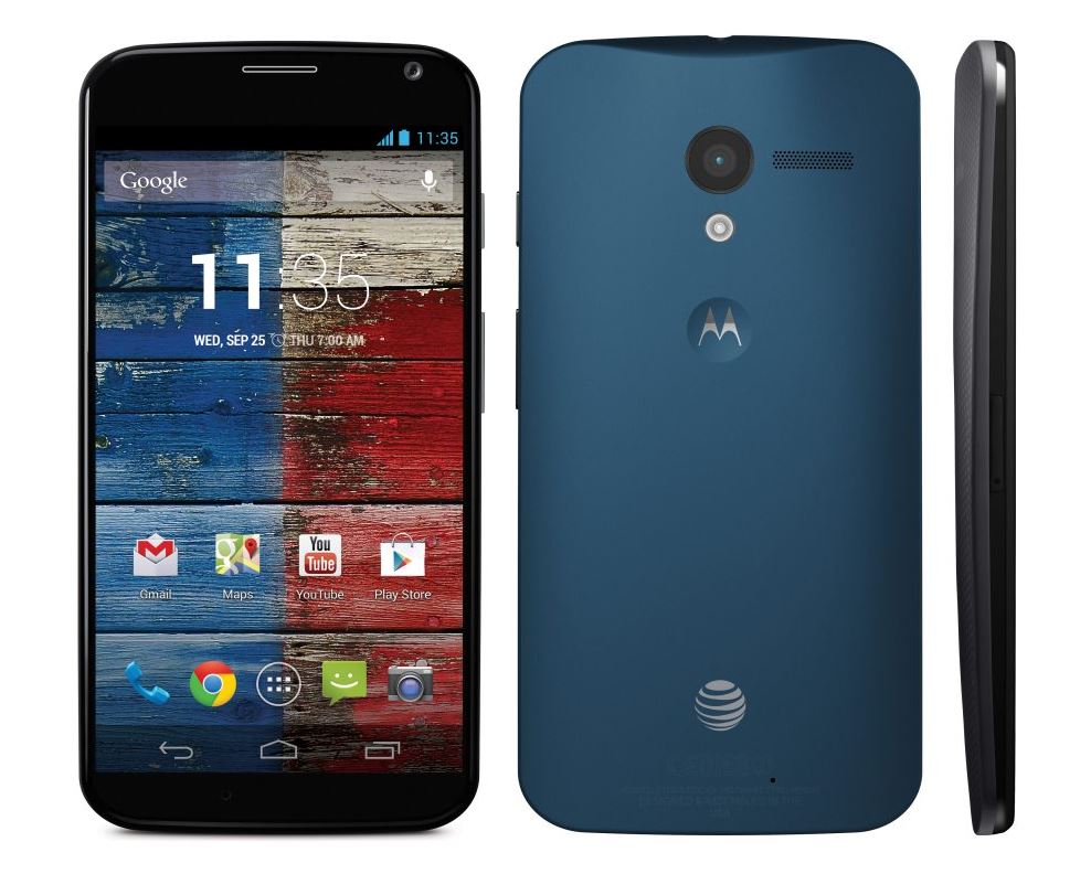
To sum up each of these points, we knew it looked like this:
We knew the specifications were a dual core Snapdragon S4 at 1.7 GHz with an Adreno 320 GPU, a 4.7” AMOLED 720p screen using “Magic Glass” (which is Gorilla Glass that wraps around the side of the phone without any gap), 2 GB of RAM, a 10MP rear camera, a 2MP front camera, Bluetooth 4.0, NFC, 802.11a/g/b/n/ac dual band WiFi, 4G LTE, and would be available in a 16GB and 32GB variants.
We knew the software. It would be running Android 4.2 (which seemed a little strange considering that Google had just released Android 4.3, you would expect that a “Google Phone” would be running the latest version of Android. This should have been another red flag.) It would have Google Now (voice activation), Active Display, Motorola Connect, Motorola Migrate, and Motorola Assist, as well as some extra camera features not present on stock Android.
We knew it would be available on the five major US carriers: AT&T, Sprint, US Cellular, Verizon Wireless, and T-Mobile.
We were fairly sure that based on Google’s pricing on Nexus phones as well as from the middling specifications of the Moto X that it would probably be priced around $300 off-contract. The majority of news outlets and analysts appeared to share that view as well.
At this point, I was looking forward to the official launch day of August 1st. I said to myself “I’m going to replace this miserable Droid 3 (I had to downgrade after accidentally smashing my Droid 4) with a new phone that may not be the most highly spec’ed, but will be modern, have almost stock Android, will have a few interesting software features, will be reasonably priced, available on Verizon, and will tide me over until I can do a full upgrade in August 2014.”
August 1st finally arrived. As a result, on August 2nd - I bought myself a replacement Droid 4.
You might be asking yourselves why I would spend $190 on a phone that is a year and a half old. The reason is simple – the Moto X is a complete disaster.
The phone was officially “released” on August 1st to all major carriers. What this meant was that the phone would start seeing availability around the end of August/beginning of September. We were told that the 16 GB model would be $199 on-contract, and that the 32 GB model would be $249 on-contract. However, the kicker is that the 32 GB model will only be available on AT&T at first, and the customizable colors for the phone would initially only be available for AT&T customers. While we didn’t immediately know what the off-contract pricing for the phone would be, one thing was clear: it would be expensive. This meant Google + Motorola expected the Moto X would compete as a high end phone. Our fears were confirmed when AT&T stated the off-contract price for the Moto X would be $575 for the 16 GB version, and $630 for the 32 GB version. To put this in perspective, the Google Edition HTC One is currently available in the Google Play store for $600. The HTC One has the same sized screen as the Moto X with a better resolution, a better CPU, a slightly larger battery, and comes standard with 32 GB of storage space.
It was bad enough that Google and Motorola thought they could sell this mid-range device at a high-end price, as well as snubbing anyone not on AT&T, but what was bad soon became worse. We found out that the Moto X would come with carrier bloatware and a locked bootloader. Motorola has been releasing phones with locked bootloaders for a long time, but we expected that Google’s influence would prevent them from doing something so blatantly restrictive. We have since discovered that the Moto X sold for Sprint, T-Mobile, U.S. Cellular, and Rogers networks would come with the bootloader locked, but would have an unlocker tool provided by Motorola for the customer to use. Obviously missing from that list are Verizon, and Google + Motorola’s preferred carrier: AT&T. This is because Verizon and AT&T will only sell Moto X phones with locked bootloaders that cannot be unlocked until they release the “Developer Edition” of the phone. As we know, “Developer Editions” are never available at an on-contract price, so expect to pay $575+ for a Moto X with an unlocked bootloader.
To sum up the current situation, what you’re looking at is a phone with mediocre specifications, a locked bootloader, carrier bloatware included, with no expandable storage, and no sufficient storage option on any carrier except AT&T, at the highest possible price point for a phone: $200-$250 on-contract, $575-$700 off-contract (Best Buy will be selling the Moto X at $700 off-contract). This is especially ludicrous when considering that this month, LG will be releasing the G2 that comes packed with a Snapdragon 800 quad core processor that exists in an entirely different league of performance from the Snapdragon S4. What makes this situation even more laughable is that the G2 will be priced similarly to the Moto X. Why anyone would even consider the Moto X as an option at that point is beyond my comprehension.
Soon afterwards, Google announced they would be releasing a Google Play Edition of the phone which comes with stock Android. This raises the obvious question of why Google needs to release a Google Play Edition of a phone they created. The Moto X should have provided a Google experience to begin with; they shouldn’t have to release a Google edition of a Google phone. The one shred of hope that exists in this news is the very slim chance that the Google Play Edition will release at a reasonable price point (around $300). If that’s the case, it will be the only chance the Moto X has at achieving any sort of success. However, I seriously doubt Google will do something that intelligent given how completely disastrous the Moto X has been thus far.
For those of you that chose not to read the rest of this article, this nugget of advice should be all you need: If you’re considering buying a Moto X, don’t. If you want to spend $200 on an on-contract device and can’t wait for something new to come out, buy a Galaxy S4 or an HTC One. If you want to spend $600 on an off-contract device and can’t wait for something new to come out, buy a Google Play Edition Galaxy S4 or HTC One. If you want to spend $200 on an on-contract device or $600 on an off-contract one, and you don’t mind waiting a bit, within the next couple months, you’ll see the release of various phones running Snapdragon 800 processors that will thoroughly embarrass the Moto X even more than the current crop of (months old) Snapdragon 600 based devices.
Google and Motorola should be ashamed of themselves. When I began this article saying that I expected a Google product launch made by Motorola, but instead got a disastrous Motorola launch, it’s because I meant this: Motorola has long released products with mediocre specifications at stupidly high price points that come riddled with MotoBlur garbage, carrier bloatware, and locked bootloaders. They’ve tried to sell these devices by using misleading marketing for years; this “X8 eight-core chip” nonsense is something right out of their standard playbook. This type of product release is exactly what I would have expected from Motorola, but not what I would have expected from Google. I thought that by acquiring Motorola Mobility, Google would turn it into a subsidiary that would churn out products that Google would be proud of. Instead we’ve been presented with more of the same Motorola crap that now comes with the Google stamp of approval. Proof of this approval is that Google will supposedly be spending $500mil on advertising this abomination. I hope that sales are nonexistent, and that Google burns through that $500mil with no result. I want the market to brutally punish Google and Motorola for trying to peddle garbage at luxury pricing. They’ve clearly taken a page out of Apple’s book, and it disgusts me. I would call for a boycott of the Moto X, but it shouldn’t be necessary; after all, people should only buy decent phones to begin with, so the Moto X shouldn’t even be on the list of possible options.
If we at Bright Side of News had an award for products that should never even be considered for purchase, the Moto X would be a clear winner.
PS. For anyone wondering why I decided to buy a replacement Droid 4, which is both 1.5 years old as well as a Motorola device, the answer is simple: physical keyboards are awesome. They provide accurate, tactile feedback that is completely unmatched by the software keyboards available on smartphones today (but that's an article for another day). In any case, I manage by rooting the phone and replacing the ROM (thanks to the awesome hackers on the XDA Dev forums) thereby eradicating as much of the Motorola crapware as I can. Had the Moto X included a physical keyboard, it would have given them a differentiator more substantial than some ridiculous color customizations. If you want me to even think about trading away my physical keyboard, you'll have to do a lot better than the Moto X.


